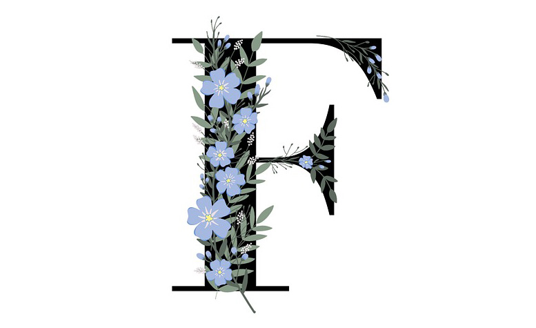
After all, serif fonts can be used to create the perfect atmosphere for a reader to immerse themselves into a fictional world.
But what is a serif font and what are they used for? That’s exactly what we’re going to present in this blog post, along with the 11 best serif fonts for fiction books.
Keep reading to find out which serif fonts you should consider for your next novel!
What Is A Serif Font?
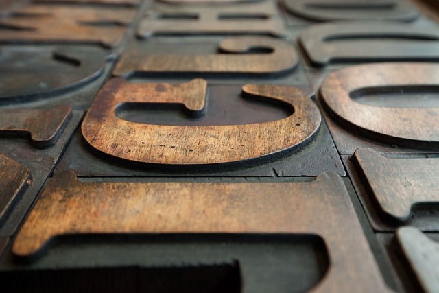
A serif font is one of the two main kinds of typefaces; the other type being sans serifs. Serif fonts are characterized by their fine strokes on the ends of characters and they often have small decorations attached at the end of letter forms.
These decorations give serif fonts their unique, sophisticated look that make them perfect for creating atmosphere in fiction books.
Serif fonts are also highly legible since their letters are easily distinguishable with their fine strokes and flourishes. This makes them ideal for long passages of text since they’re not as tiring on readers’ eyes as sans serif fonts can often be.
To put it simply, serif fonts offer authors an easy way to make their fiction books stand out from others and attract readers with a unique look.
What Are Serif Fonts Used For?
Serif fonts are commonly used for marketing messaging that needs to convey a sense of traditional elegance, such as real estate copy to market “old world” home designs, expensive watches, classic cars, etc. They’re usually associated with style and status.
However, one of the most popular uses for serif fonts is in fiction books. The subtle decorations on serif letters add the touch of grace and elegance that storytelling often requires, helping readers get lost in another world as they immerse themselves into the narrative.
What Is The Most Popular Fiction Serif Font And Why?

One of the most popular serif fonts for fiction books is Baskerville Old Face, which was created by John Baskerville during the 18th century in England, and was originally designed as a transitional font between old-style roman typefaces and more (then) modern styles.
Its popularity lies mainly in its high legibility due its larger x-heights (the height of lowercase letters not including ascenders or overshoots) making it easier to read at smaller sizes, which makes it perfect for long passages of text found in fiction books.
Baskerville Old Face has been used extensively throughout history by renowned authors so it’s no surprise why this classic font has become so popular over time among authors looking for that timeless look and feel.
What Are 11 Best Serif Fonts For Fiction Books?
Without further ado, here are the top 11 serif fonts to consider for your next fiction book project:
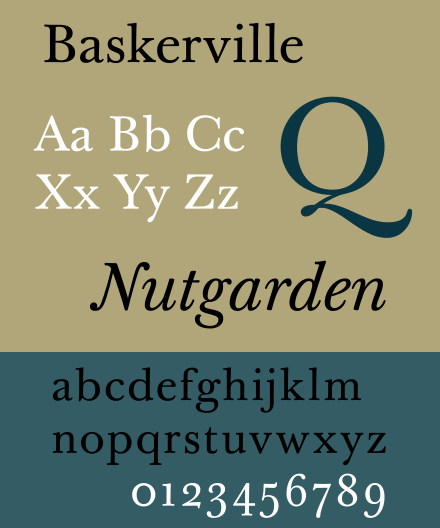
1) Baskerville:
This serif font was designed by John Baskerville during the 1750s specifically with printing in mind, making it perfectly suited for fiction books where readers will be reading lots of text over extended periods of time while minimizing eye train.
Its wider serifs, moderate stroke contrast, along with its slightly condensed letter forms gives the typeface an overall elegant yet modern look perfect for contemporary fiction stories such as romances and thrillers.
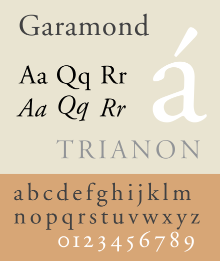
2) Garamond:
Perhaps one the oldest serif typefaces still widely used today, Garamond was designed in the sixteenth century by French engraver Claude Garamond.
It features delicate details such as narrow counters, small ascenders and descenders along with slightly slanted letter forms, giving it a slightly old-world feel perfect for romance and period piece stories.
Garamond has been extensively used throughout history because its timeless elegance never fails to capture the audience’s attention, making it one if not the go-to choice when looking for an old school charm effect.
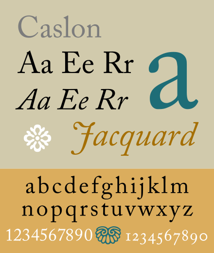
3) Adobe Caslon:
This modern adaption of William Caslon’s original design was created by Carol Twombly during 1990 specifically with extended texts like novels and newspapers in mind, while staying true to its original source material.
While still retaining all of its original legibility characteristics, Adobe Caslon includes some improvements such as wider counters, bigger ascenders and descenders, and less pronounced stroke contrast.
This grants this font an overall more contemporary look while still keeping some of its elegant namesake features intact.
The original Caslon typeface was designed by British typographer William Caslon during the 18th century to allow for the reading of long passages of text with less eye strain.
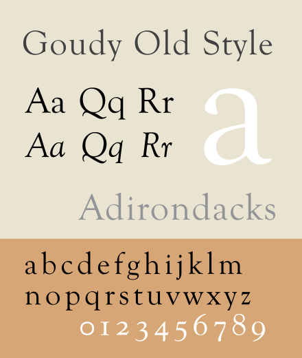
4) Goudy Old Style:
Originally designed by Frederic Goudy, this classic serif font combines traditional elements such as large x-heights along wide open counters with some unexpected details like long ascenders.
With shorter descenders creating an overall look reminiscent of traditional calligraphy typefaces, the Goudy Old Style font maintains its legibility and readability, making it a perfect fit for long passages of text.
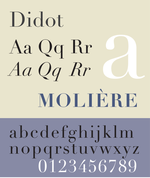
5) Didot:
This popular serif typeface is derived from a group of typefaces designed during the late 18th century by the famous French type-making Didot family.
Its popularity among authors is mainly due to its balanced yet elegant look, which can be combined with other serif fonts to create stunning book covers and manuscripts.
Didot is perfect for books of all genres, ranging from romances to tragedies, making it a popular choice among modern day fiction publishers.
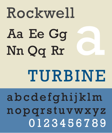
6) Rockwell:
This bold serif font was designed by Monotype in 1934 and is today one of the most popular modern-looking serif fonts in use, largely thanks to its strong personality along with its heavy serifs and bold curves, making it perfect for titles and headlines.
Its strong impact can be used to create contrast between serif elements as well as noticeable focal points on book covers and manuscripts.
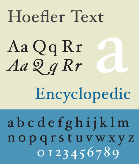
7) Hoefler Text:
This serif typeface was designed by Jonathan Hoefler during the early 90s and has been used extensively ever since due to its unique combination of serif elements, wide open counters and slightly condensed letter forms, giving it an overall contemporary yet timeless look.
Its high readability makes it perfect for fiction books where the reader will be able to enjoy long passages of text without struggling with eye strain.
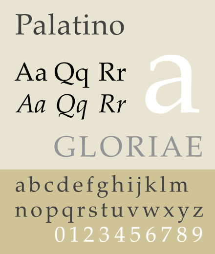
8) Palatino:
Designed by Hermann Zapf in 1949 specifically for book titles and headlines, this serif font is one of the go-to choices when looking for a modern serif style.
With its large x-heights, balanced serifs and moderate stroke contrast, Palatino conveys elegance and readability in equal measures, making it perfect for novels and storybooks.
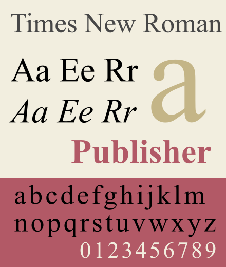
9) Times New Roman:
This serif font was designed by Stanley Morison in 1931 and is one of the most commonly used serif fonts in publishing today thanks to its excellent legibility combined with its balanced serifs and moderate stroke contrast.
Its simple yet elegant look makes it perfect when trying to create a professional timeless feel while still maintaining maximum readability and legibility.
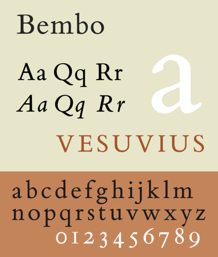
10) Bembo:
This serif typeface was originally designed by Monotype in 1929 but has been updated since due to its excellent readability and elegant serif style.
Bembo is widely used in fiction books due to its contemporary yet classic look, which can be used to create stunning fiction manuscripts.
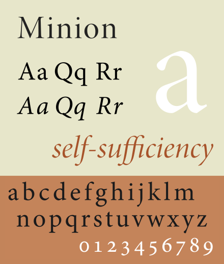
11) Minion Pro:
This serif font was designed by Robert Slimbach in 1990 specifically for magazine publishing but has been widely used for fiction books titles and headings ever since due to its excellent readability, combined with its contemporary look.
Its wide serifs and moderate stroke contrast makes it perfect for book covers as well as manuscript formatting, making sure readers can enjoy long passages of text without struggling to keep focus.
In conclusion
From timeless serif classics like Garamond or Goudy Old Style, to more modern choices such as Minion Pro or Hoefler Text, choosing the right serif font for your fiction book has never been easier.
Whether you’re an author looking to craft a timeless romance novel or a designer needing to add that special touch of elegance to your current project, serif fonts are one of the most versatile and useful type families available for the task.
No matter what serif font you choose, remember that they all have their own personality and impact, so make sure to find one which fits your fiction book the best.
Good luck!
Harry Wallett is the Founder and Managing Director of Relay Publishing. Combining his entrepreneurial background with a love of great stories, Harry founded Relay in 2013 as a fresh way to create books and for writers to earn a living from their work. Since then, Relay has sold 3+ million copies and worked with 100s of writers on bestselling titles such as Defending Innocence, The Alveria Dragon Akademy Series and Rancher’s Family Christmas. Harry oversees the creative direction of the company, and works to develop a supportive collaborative environment for the Relay team to thrive within in order to fulfill our mission to create unputdownable books.
Relay Publishing wants you
If you think you have what it takes to become a brilliant writer, editor, or storyliner, Relay Publishing has a range of exciting opportunities.
Find out more about us, and get in touch. We can’t wait to hear from you!